Question 1:
Give some examples of data that you can collect from your day to day life.
Answer:
Some examples of data that we can gather from
our day to day life are:
(i) Number of students in our class.
(ii) Number of fans in our school.
(iii) Electricity bills of our house for last two years.
(iv) Election results obtained from television or newspapers
(v) Literacy rate figures obtained from Educational Survey.
(vi) Heights of 20 students of your class.
(vii) Maximum temperature of the days of a particular week from television.
(viii) Number of members in the families of your locality from a record.
(ix) Distance of the school from their home of ten students.
Of course, remember that there can be many more different answers.
Question 2:
Classify the data below as primary or secondary data:
(i) Number of students in our class.
(ii) Number of fans in our school.
(iii) Electricity bills of our house for last two years.
(iv) Election results obtained from television or newspapers
(v) Literacy rate figures obtained from Educational Survey.
(vi) Heights of 20 students of your class.
(vii) Maximum temperature of the days of a particular week from television.
(viii) Number of members in the families of your locality from a record.
(ix) Distance of the school from their home of ten students.
Answer:
Primary data: When the information was
collected by the investigator herself or himself with a
definite objective in his or her mind, the data obtained is
called Primary data. This type of data are original in
character and collected for the first time for their own
use.
Above mentioned (i), (ii), (iii), (vi) and (ix) are the
examples of primary data.
Secondary data: When the information was gathered
from a source (like newspaper, television or some
records) which already had the information stored is
called Secondary data. Such data has been collected
by someone else in another context needs to be used
with great care. These data are collected for a purpose
other than that of original investigator. Above
mentioned (iv), (v), (vii) and (viii) are the examples of
secondary data.
Remark: Primary data are more reliable than secondary
data because in primary data; all details are collected
relevant to the investigator’s study.
Presentation of data: As soon as the work related to
collection of data is over, the investigator has to find
ways to condense them in a form which is meaningful,
easily understandable and gives its salient features at a
glance. So, we need to find out ways to present our data
in an appropriate form. Let us define the various types
of data and ways of presenting the data.
I. Raw Data
When the investigator has collected the data and he has not arranged the same in a
systematic manner it is called
raw data or unorganised data.
Arraying of the data: When the individual units are arranged in ascending or descending
order then it is called as arraying of the data. This presentation though better than the
raw data, does not reduce the volume of the data.
Range: The difference between the highest and the lowest values of the observations in given
data is called the range.
Formulation of frequency distribution: A frequency distribution shows the frequency of
occurrence of different values of a single phenomenon.
When the number of observations is large, we make use of tally marks to count the
frequencies. Tallies are usually
marked in bunches of five for ease of counting.
Frequency distribution is constructed for the following reasons:
(a) to facilitate the analysis of data.
(b) to facilitate calculation of different statistical measures.
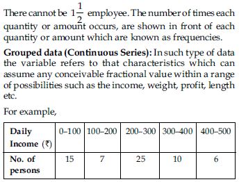
II. Ungrouped data (Discrete Series)
In such type of data the variable refers to that characteristics which cannot be expressed
in fractions or it is a fraction less variable. There will be either one employee or two.
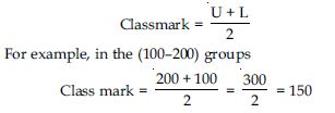
Class: Each stated interval such as 0–100, 100–200 etc. is called a class.
Class limits: There are two limits of every class. The lower value of a class is called the
lower limit and upper value of that class is called the upper limit of that class e.g., in
the (0–100) group. Zero is the lower limit and
100 is the upper limit.
Class interval: Difference between the upper limit (U) and lower limit (L) of a class is
known as class-interval.
i = U – L
Example: In the (0–100) group or class
i = 100 – 0 = 100
Mid values or class marks or Class mid-point: The value lying exactly in the middle or
centre of the two class
limits of a group or class is known as mid value or midpoint.
So, it is the average of two limits of the class. The mid values can be calculated by adding
the two limits and
dividing it by two.
In symbols,
Class frequency: The number of observations corresponding to a particular class is known as
the frequency of that class or class frequency. It is denoted generally by f. The sum of
frequencies is denoted by Σf or N.
Types of grouped data: The grouped data (or Continuous series) are mainly of following
types:
1. Inclusive series 2. Exclusive series
3. Cumulative frequency distribution
4. Equal class interval series.
In inclusive series upper limit of a class is less than lower limit of next class when
classes are arranged in ascending order. In this type, overlapping of class intervals is
avoided. Both the upper and lower limits are included in the class interval e.g.,
In the above series, values 19, 29, 39 and 49 will be included in the same classes in which
they are written.
This method ignores continuity in the class intervals.
However, fractional values between 19 and 20, 29 and
30, 39 and 40 cannot be accounted in such a
classification.
In exclusive series an item whose value coincides with the upper limit of a class is
excluded from that class and is included in the next class that has an equivalent lower
limit.
e.g.,
Now upper limit 20 (or Ist class interval) is considered as slightly less than 20, i.e.,
(19.999...00) and any value equal to 20 shall not be included in this class, but in the next
class, which has a lower limit 20. Similar is the case with other classes. This method
assumes continuity in the class interval because the upper limit of one class is the lower
limit of the next class.
Conversion of inclusive series into exclusive series:
Inclusive series may be converted into exclusive series by applying the ‘‘Correction
Factor’’ to be lower and
upper limits.
Where correction factor (d)
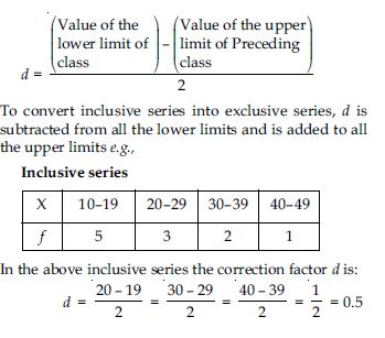
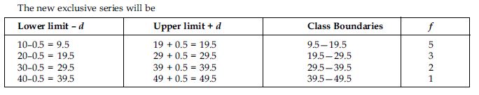
Equal and unequal class-interval series:
(a) Equal class-interval series. When the classes in a series are of the same interval
(width), it is called the equal interval series.
(b) Unequal class-interval series. When the classes in a series are not of the same width,
it is called the unequal interval series.
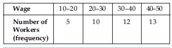
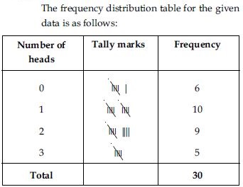
Question 3:
The blood groups of 30 students of class VIII are recorded as follows:
A, B, O, O, AB, O, A, O, B, A, O, B, A, O, O, A,
AB, O, A, A, O, O, AB, B, A, O, B, A, B, O
Represent this data in the form of a frequency distribution table. Which is the most common
and which is the rarest blood group among these students?
Answer:
The frequency distribution table for the given data is as follows:
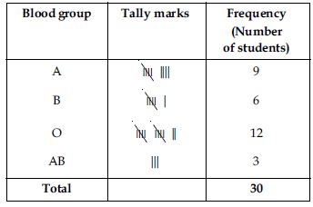
From the table we observe that most common blood group is O and the blood rarest group is AB.
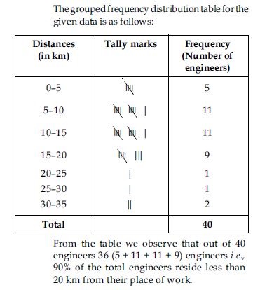
Question 4:
Distance (in km) of 40 engineers from their place of residence to their place of work were
found as follows:
5 3 10 20 25 11 13
7 12 31 19 10 12 17
18 11 32 17 16 2 7
9 7 8 3 5 12 15
18 3 12 14 2 9 6
15 15 7 6 12
Construct a grouped frequency distribution table with class size 5 for the data given above
taking the first interval as 0—5 (5 not included). What main features do you observe from
this tabular representation?
Answer:
Question 5:
The relative humidity (in %) of a certain city for a month of 30 days was as follows:
98.1 98.6 99.2 90.3 86.5 95.3 92.9
96.3 94.2 95.1 89.2 92.3 97.1 93.5
92.7 95.1 97.2 93.3 95.2 97.3 96.2
92.1 84.9 90.2 95.7 98.3 97.3 96.1
92.1 89
Construct a grouped frequency distribution table with classes 84–86, 86–88 etc.
Answer:
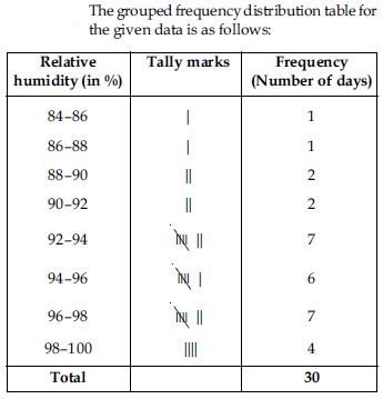
Question 6:
The relative humidity (in %) of a certain city for a month of 30 days was as follows:
98.1 98.6 99.2 90.3 86.5 95.3 92.9
96.3 94.2 95.1 89.2 92.3 97.1 93.5
92.7 95.1 97.2 93.3 95.2 97.3 96.2
92.1 84.9 90.2 95.7 98.3 97.3 96.1
92.1 89
Which month or season do you think this data is about?
Answer:
From the data we observe that relative humidity is high. So data appears to be taken in the rainy season.
Question 7:
The relative humidity (in %) of a certain city for a month of 30 days was as follows:
98.1 98.6 99.2 90.3 86.5 95.3 92.9
96.3 94.2 95.1 89.2 92.3 97.1 93.5
92.7 95.1 97.2 93.3 95.2 97.3 96.2
92.1 84.9 90.2 95.7 98.3 97.3 96.1
92.1 89
What is the range of this data?
Answer:
From the data we observe that Highest relative humidity = 99.2% Lowest relative humidity = 84.9% Range = (99.2 – 84.9)% = 14.3%
Question 8:
The heights of 50 students, measured to the nearest centimetres have been found to be as
follows:
161 150 154 165 168 161 154 162
150 151 162 164 171 165 158 154
156 172 160 170 153 159 161 170
162 165 166 168 165 164 154 152
153 156 158 162 160 161 173 166
161 159 162 167 168 159 158 153
154 159
Represent the data given above by a grouped frequency distribution table, taking the
class-intervals as 160–165, 165–170 etc.
Answer:
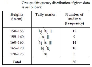
Question 9:
The heights of 50 students, measured to the nearest centimetres have been found to be as
follows:
161 150 154 165 168 161 154 162
150 151 162 164 171 165 158 154
156 172 160 170 153 159 161 170
162 165 166 168 165 164 154 152
153 156 158 162 160 161 173 166
161 159 162 167 168 159 158 153
154 159
What can you conclude about their heights from the table?
Answer:
From the frequency distribution table drawn above; we conclude that more than 50% of the students are shorter than 165 cm.
Question 10:
A study was conducted to find out the concentration of sulphur dioxide in the air in parts
per million (ppm) of a certain city. The data obtained for 30 days is as follows:
0.03 0.08 0.08 0.09 0.04 0.17
0.16 0.05 0.02 0.06 0.18 0.20
0.11 0.08 0.12 0.13 0.22 0.07
0.08 0.01 0.10 0.06 0.09 0.18
0.11 0.07 0.05 0.07 0.01 0.04
Make a grouped frequency distribution table for this data with class intervals as 0.00–0.04,
0.04–0.08 and so on.
Answer:
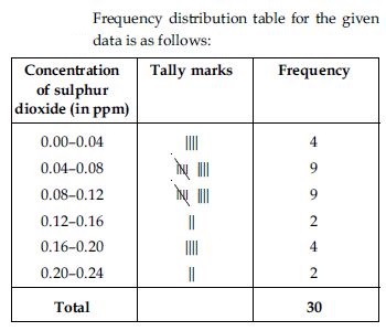
Question 11:
A study was conducted to find out the concentration of sulphur dioxide in the air in parts
per million (ppm) of a certain city. The data obtained for 30 days is as follows:
0.03 0.08 0.08 0.09 0.04 0.17
0.16 0.05 0.02 0.06 0.18 0.20
0.11 0.08 0.12 0.13 0.22 0.07
0.08 0.01 0.10 0.06 0.09 0.18
0.11 0.07 0.05 0.07 0.01 0.04
For how many days, was the concentration of sulphur dioxide more than 0.11 parts per
million.
Answer:
From the frequency distribution table we observe that the concentration of sulphur dioxide was more than 0.11 ppm for 8 days.
Question 12:
Three coins were tossed 30 times simultaneously. Each time the number of heads occurring was
noted down as follows:
0 1 2 2 1 2 3 1 3
0 1 3 1 1 2 2 0 1
2 1 3 0 0 1 1 2 3
2 2 0
Prepare a frequency distribution for the data given above.
Answer:
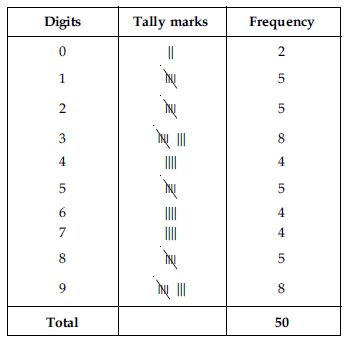
Question 13:
The value of π upto 50 decimal places is given below:
3.1415926535 8979323846 2643383279 5028841971 6939937510
Make a frequency distribution of the digits after the decimal point list the digits from 0
to 9 in your first column.
Answer:
The value of π upto 50 decimal places is given as below:
π = 3.1415926535 8979323846
2643383279 5028841971 6939937510
The frequency distribution table of the digits after the decimal point in the value of π is
as follows:
Question 14:
The value of π upto 50 decimal places is given below:
3.1415926535 8979323846 2643383279 5028841971 6939937510
What are the most and the least frequency occurring digits?
Answer:
Maximum frequency is 8.
Hence, 3 is the most frequently occurring digit.
Least frequency is 2.
Hence, 0 is the least occuring digit.
Question 15:
Thirty children were asked about the number of hours they watched TV programmes in the
previous week. The results were found as follows:
1 6 2 3 5 12 5 8 4
8 10 3 4 12 2 8 15 1
17 6 3 2 8 5 9 6 8
7 14 12
Make a frequency distribution table for this data, taking class width 5 and one of the class
interval as 5–10.
Answer:
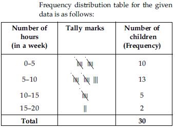
Question 16:
Thirty children were asked about the number of hours they watched TV programmes in the
previous week. The results were found as follows:
1 6 2 3 5 12 5 8 4
8 10 3 4 12 2 8 15 1
17 6 3 2 8 5 9 6 8
7 14 12
How many children watched television for 15 or more hours a week?
Answer:
From the frequency table we observe that number of children in the class interval 15–20 is 2. So, 2 children view television for 15 hours or more than 15 hours a week.
Question 17:
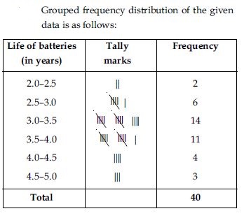
A company manufactures car-batteries of particular type. The lives (in years) of 40 such
batteries were recorded as follows:
2.6 3.0 3.7 3.2 2.2 4.1 3.5 4.5
3.5 2.3 3.2 3.4 3.8 3.2 4.6 3.7
2.5 4.4 3.4 3.3 2.9 3.0 4.3 2.8
3.5 3.2 3.9 3.2 3.2 3.1 3.7 3.4
4.6 3.8 3.2 2.6 3.5 4.2 2.9 3.6
Construct a grouped frequency distribution table for this data, using class ntervals of size
0.5 starting from the interval 2—2.5.
Answer:
Question 18:
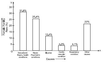
A survey conducted by an organisation for the cause of illness and death among the women between the ages 15 – 44 (in years) worldwide, found the following figures (in %):
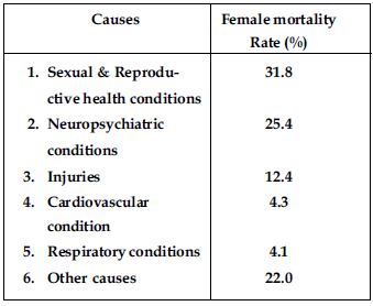
Represent the information given above graphically.
Answer:
We represent the given information in the form of a bar graph. We construct the bar
diagram through the following steps:
Step 1: Draw two perpendicular axes OX and OY on a plain paper.
Step 2.: Along OX mark ‘‘Causes’’ and along OY ‘‘Female Fertility Rate (%)’’.
Step 3: Along OX, choose suitable width for each bar.
Step 4: Along OY, choose an appropriate scale and mark the Female Fertility Rate (%).
Scale chosen:
On y-axis;
1 large division
i.e., 1 cm = 5%
Question 19:
A survey conducted by an organisation for the cause of illness and death among the women between the ages 15 – 44 (in years) worldwide, found the following figures (in %):
Which condition is the major cause of women’s ill health and death worldwide?
Answer:
From the bar graph we observe that sexual and reproductive health condition is the major cause of woman ill health and mortality worldwide.
Question 20:
A survey conducted by an organisation for the cause of illness and death among the women between the ages 15 – 44 (in years) worldwide, found the following figures (in %):
Try to find out, with the help of your teacher, any two factors which play a major role in the cause in (ii) above being the major cause.
Answer:
Two major factors for poor sexual & reproductive health conditions are as follows:
1. Lack of awareness among women.
2. Lack of medical facilities.
Question 21:
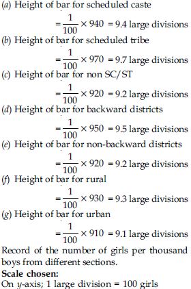
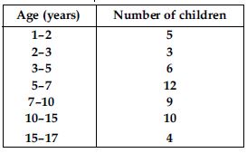
The following data on the number of girls (to the nearest ten) per thousand boys in different sections of Indian Society is given below:
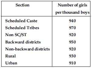
Represent the information above by a bar graph.
Answer:
We represent the given information in the form of a bar graph. We construct the bar diagram
through the following steps:
Step 1: Draw two perpendicular axes OX and OY on a plain paper.
Step 2: Along OX mark ‘‘Section’’ and along OY mark ‘‘ Number of girls per thousand
boys.’’
Step 3: Along OX choose suitable width for each bar.
Step 4: Along OY choose an appropriate scale. Here choose 1 large division = 100 girls.
Step 5: Calculate the heights of the various
bars as follows:
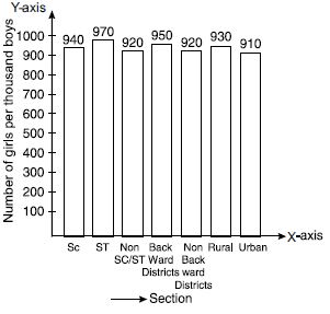
Question 22:
The following data on the number of girls (to the nearest ten) per thousand boys in different sections of Indian Society is given below:
In the classroom discuss what conclusions can be arrived at from the graph.
Answer:
From the graph we observe that in each section the number of girls are nearly same. We also observe that the number of girls in each section are less than the boys.
Question 23:
Given below are the seats won by different political parties in the polling outcome of a state assembly elections:
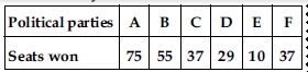
Draw a bar graph to represent the polling results.
Answer:
We represent the given information in the form of a bar graph which is drawn as follows:
Seats won by different political parties in the polling outcome of the state assembly
elections.
Scale chosen: On y-axis; 1 large division
i.e., 1 cm = 10 seats
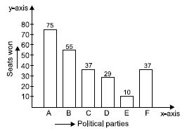
Question 24:
Given below are the seats won by different political parties in the polling outcome of a state assembly elections:
Which political party won the maximum number of seats?
Answer:
Out of all won seats; 75 is the maximum.
So, party A has won maximum number of seats.
Question 25:
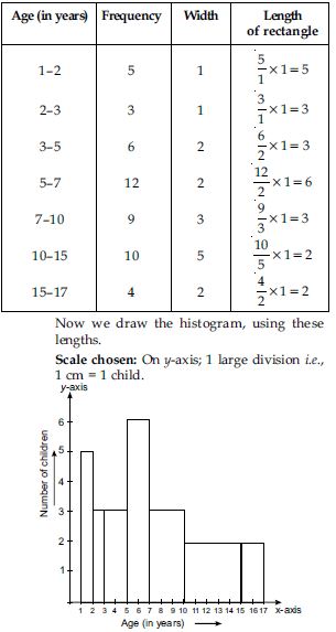
The length of 40 leaves of a plant are measured correct to one millimetre, and the obtained data is represented in the following table:
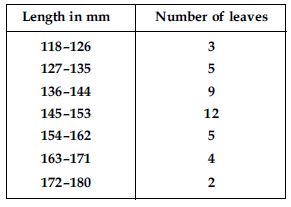
Draw a histogram to represent the given data.
Answer:
We first make the distribution continuous (i.e., inclusive to exclusive form) as given below: Let us find half the difference between the lower limit of a class and upper limit of its preceding class i.e.,
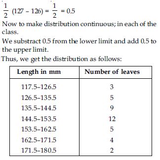
Length of 40 leaves of a plant measured correct to one millimetre.
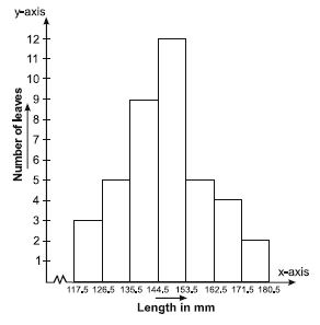
Scale chosen: On y-axis; 1 large division
i.e., 1 cm = 1 leaf
We represent the given data in the form of a histogram which is as follows:
Question 26:
The length of 40 leaves of a plant are measured correct to one millimetre, and the obtained data is represented in the following table:
Is there any other suitable graphical representation for the same data?
Answer:
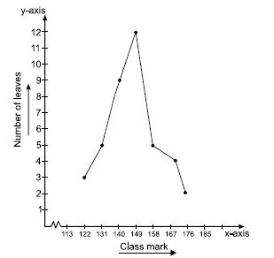
Yes, we can represent the given data by other graphical representation named as frequency
polygon which is as follows:
First of all we prepare a table with class-marks and corresponding number of leaves.
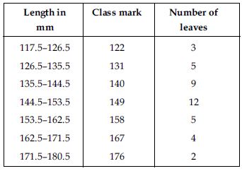
We plot the class-mark on x-axis and number of leaves on y-axis.
We plot the ordered pairs (122, 3), (131, 5) ...(176, 2).
Join them by line-segments to get the frequency polygon.
Scale chosen: On x-axis;
1 cm = 9
On y-axis; 1 large division
i.e., 1 cm = 1 leaf
Question 27:
The length of 40 leaves of a plant are measured correct to one millimetre, and the obtained data is represented in the following table:
Is it correct to conclude that the maximum number of leaves are 153 mm long? Why?
Answer:
No, because the maximum number 12 is corresponding to the class interval 145–153 which implies that the leaves whose length are 145 mm or less than 153 mm are maximum in number.
Question 28:
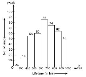
The following table gives the lifetimes of 400 neon lamps:
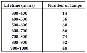
Represent the given information with the help of a histogram.
Answer:
We represent the given information in the form of histogram which is as follows:
Lifetime (in hrs) of 400 neon lamps
Scale chosen: On y-axis; 1 large division i.e., 1 cm = 10 lamps
Question 29:
The following table gives the lifetimes of 400 neon lamps:
How many lamps have a lifetime of more than 700 hours?
Answer:
Number of lamps having lifetime more than 700 hours = 74 + 62 + 48 = 184
Question 30:
The following table gives the distribution of students of two sections according to the marks obtained by them:
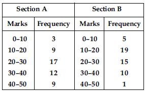
Represent the marks of the students of both the sections on the same graph by two
frequency polygons. From the two polygons compare the performance of the two sections.
Answer:
We represent the given information in the form of frequency polygon.
So, we prepare a table with class-marks and corresponding number of students of sections A
and B.
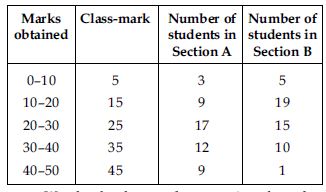
We plot the class-marks on x-axis and number of students on y-axis.
We plot the ordered pairs (5, 3), (15, 9), (25, 17), (35, 12) and (45, 9). Join them by
line-segments to get the frequency polygon for Section A.
We plot the ordered pairs (5, 5), (15, 19), (25, 15), (35, 10) and (45, 1). Join these by
dotted line-segments to get the frequency polygon for Section B.
Scale chosen: On x-axis; 1 large division i.e.,
1 cm = 10 marks. On y-axis; 1 large division i.e., 1 cm = 2 students
From the graph, we observe that
Students of Section A performed better; because as we move right on x-axis the number of
students are spread widely over greater marks as compared to the students of Section B.
Question 31:
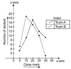
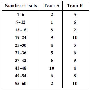
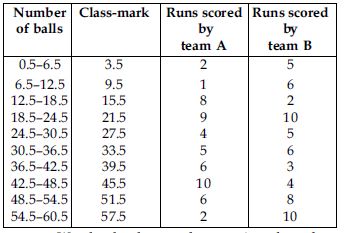
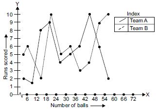
The runs scored by two teams A and B in the first 60 balls in a cricket match are given below:
Represent the data of both the teams on the same graph by frequency polygons.
Answer:
We represent the given information in the form of frequency polygon.
We first make the class intervals continuous, then find the class marks.
Correction factor,
We plot the class-mark on x-axis and number of students on y-axis.
We plot ordered pairs (3.5, 2), (9.5, 1), ..., (57.5, 2).
Join them by a line segment to get the frequency polygon for team A.
We plot the ordered pairs (3.5, 5), (9.5, 6), ..., (57.5, 10). Join them by a dotted
line-segment to get the frequency polygon for team B.
Scale chosen: On x-axis; 1 large division i.e., 1 cm = 10 marks. On y-axis; 1 large division
i.e.,
1 cm = 2 students
Question 32:
A random survey of the number of children of various age groups playing in a park was found as follows:
Draw a histogram to represent the data above.
Answer:
Here classes are not of equal size. We select the class with minimum class size. Here minimum
class size is 1.
Adjustment of frequencies (height of rectangles)
according to the class size are as follows:
Question 33:
100 surnames were randomly picked up from a local telephone directory and a frequency distribution of the number of letters in the English alphabet in the surnames was found as follows:
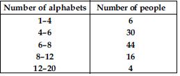
(i) Draw a histogram to depict the given information.
(ii) Write the class interval in which the maximum number of surnames lie.
Answer:
Here classes are not of equal size. We select the class with minimum class size. Here, minimum class size is 2. Adjustment of frequency (height of rectangles) according to the class size are as follows:
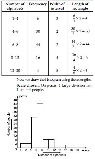
Question 34:
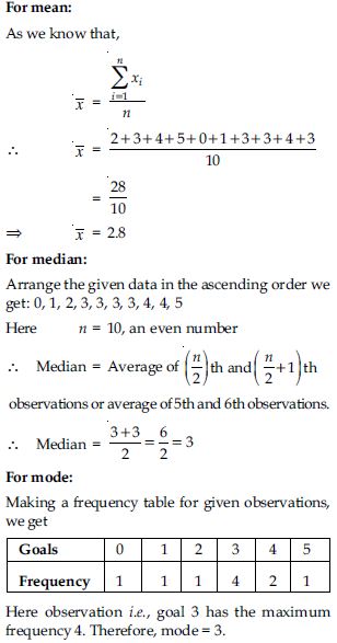
The following number of goals were scored by a team in a series of 10 matches:
2, 3, 4, 5, 0, 1, 3, 3, 4, 3
Find mean, median and mode of these scores:
Answer:
Question 35:
In a mathematics test given to 15 students, the following marks (out of 100) are
recorded:
41, 39, 48, 52, 46, 62, 54, 40, 96, 52, 98, 40, 42, 52, 60
Find the mean, median and mode of this data.
Answer:
For mean:
As we know that,
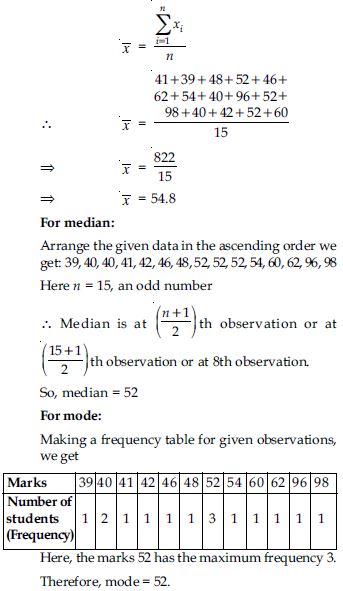
Question 36:
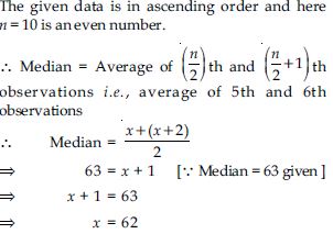
The following observations have been arranged in the ascending order. If the median of the
data is 63, find the value of x:
29, 32, 48, 50, x, x + 2, 72, 78, 84, 95
Answer:
Question 37:
Find the mode of the following data in each case:
14, 25, 14, 28, 18, 17, 18, 14, 23, 22, 14, 18
Answer:
We have 14, 25, 14, 28, 18, 17, 18, 14, 23, 22, 14, 18
Making a frequency table, we have
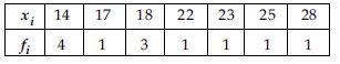
Here, the observation 14 has the maximum frequency 4.
Therefore, mode = 14
Question 38:
Find the mode of the following data in each case:
7, 9, 12, 13, 7, 12, 15, 7, 12, 7, 25, 18, 7
Answer:
7, 9, 12, 13, 7, 12, 15, 7, 12, 7, 25, 18, 7
Making a frequency table, we have
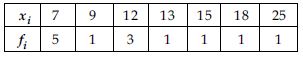
Here, the observation 7 has the maximum frequency 5. Therefore, mode = 7
Question 39:
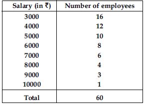
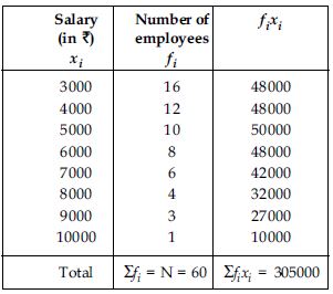
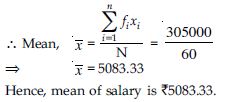
Find the mean salary of 60 workers of a factory from the following table:
Answer:
Question 40:
Give an example of a situation in which the mean is an appropriate measure of central tendency.
Answer:
Mean is the suitable measure of central tendency because every term is taken in calculation,
it is effected by every item. It can further be subjected to algebraic treatment unlike
other measures i.e., median and mode. As mean is rigidly defined, it is mostly used for
comparing the various issues.
For example, the marks obtained by the seven students are 10, 15, 14, 18, 26, 24, 20, 14 and
27
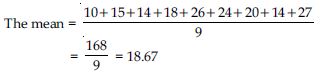
But median of 10, 14, 14, 15, 18, 20, 24, 26 and 27 is 18 and mode is 14.
From above example we conclude that mean is rigidly defined and the marks 18.67 represent
the performance of 9 students, but median and mode are not so rigidly defined.
Question 41:
Give an example of a situation in which the mean is not an appropriate measure of central tendency but the median is an appropriate measure of central tendency.
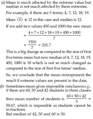
Answer: